Maxima (software) and gnuplot – plot functions using lines with symbols on it (workaround)
I am recently working on some scientific papers for which I have to visualize a lot of mathematical functions. In a good scientific paper the graphs (and visualizations in general) should be colorless and utilize dotted/dashed lines or lines with symbols on it instead of colors. This has several advantages: A colorless plot is more neutral to the reader, he/she does not get distracted by the different colors. A reader may also have a (subliminal) preference in color, so he/she pays more attention to e.g. the red curve than the yellow one, that is hardly readable on the white background anyway. This also helps to distinguish functions, if they are plotted in one diagram and printed in gray scale mode or read by color blind people. Also, if two identical functions are plotted in one diagram, using just colors will probably only show one of the functions and hide the other.
I am using the CAS software Maxima to do the calculations, which in turn uses gnuplot to plot the functions. Gnuplot alone does the job perfectly. However, when plotting functions (and not discrete data points) using lines with symbols on it from within Maxima (which also uses gnuplot to plot the graphs), the results are quite ugly. There seems to be no proper solution to this problem.
This blog post suggests a workaround that is rather ugly, but which produces very nice graphics, that meet the above-mentioned requirements.
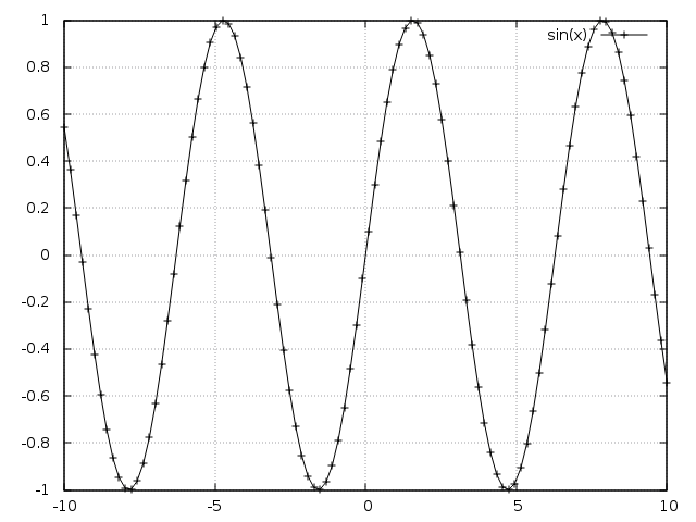
As mentioned before, gnuplot does the job just fine, e.g.:
gnuplot> plot sin(x) with linespoints lc rgb "black"
If the equivalent is done in Maxima:
(%i1) plot2d([sin(x)], [x, -10, 10], [style, linespoints], [color, black], [legend, "sin(x)"])$
, you get the following result:
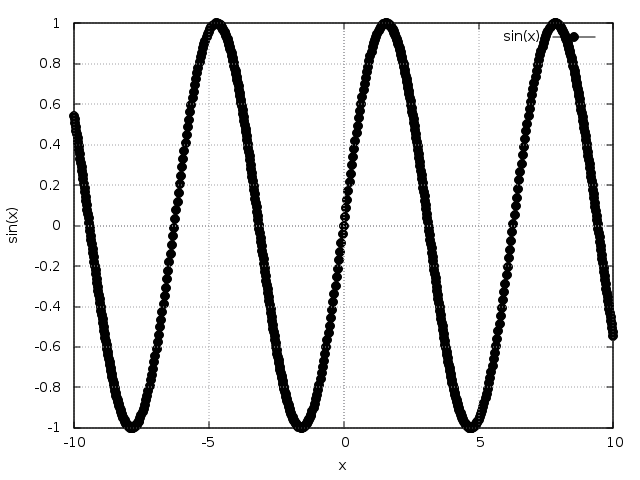
Maxima causes gnuplot to draw a symbol (in this case a “bullet”) on each sample point it provides. To draw a smooth curve, the sample rate is (by default) quite high, which in turn results in such a high density of points. That is the reason why the line appears to be thick. That of course defeats the purpose and decreases readability instead of increasing it.
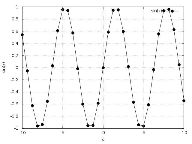
You can use the “adapt_depth” option in conjunction with “nticks”, but that lowers the sampling rate and reduces the smoothness of the curve. It basically produces points that are connected through a line: mathematically speaking, a continuous but not differentiable function. The following gives an (extreme) example:
(%i1) plot2d([sin(x)], [x, -10, 10], [style, linespoints], [color, black], [legend, "sin(x)"], [adapt_depth, 1], [nticks, 4])$
The workaround I came up with “fakes” a line with symbols on it by simply overlaying three plots, making them look like one single smooth curve with symbols on it. The steps are:
- plot the desired function “normally” with the style “lines”
- create a list of points from the function and plot them on top of the “normal” function using the option “makelist”
- add a “fake” point to the plot that is out of range and therefore not shown in the plot (this will give you a correct, “faked” legend on the plot)
- use the option “style” and set the values to “lines” for the “normal” function, “points” for the points on it and “linespoints” for the “fake” point
- now use the option “legend” and set an empty value (“”) for the function and the points on it, only naming the “fake” point after the desired function you want to plot
Here is an example:
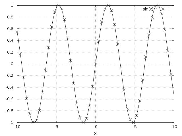
plot2d(
[sin(x), [discrete, makelist([x, sin(x)], x, -10, 10, 0.4)], [discrete, [20], [0]]],
[x, -10, 10],
[style, lines, points, linespoints],
[color, black],
[point_type, times],
[legend, "", "", "sin(x)"]
)$
This should be easier, though. I really like Maxima (and gnuplot), but this is certainly a very basic and vital feature that is missing. Anyway, the workaround gets the job done for now.